Portraits that stopped me in my tracks

One portrait that I have always loved is The Desperate Man by Gustave Courbet. It is such a simple portrait in the way that there is nothing in the background. The man from the chest up fills the canvas with his arms bent, hands clutching fistfuls of his hair. He wears a loose white shirt under what seems to be a black apron fastened around his neck. But it is the white in his crazed eyes that really draws my attention. There is a level of incredible tension and anxiety about this piece that I find so interesting and also mysterious; this is not a pose that you would expect to find someone observing themselves doing. You can feel the tension in the taut muscles of the man’s forearms and neck. The dramatic lighting in the piece adds to the mystery and also the theatric quality of his crazed expression. I love the simplicity of the composition mixed with the heavy emotion and charged atmosphere.

The piece that I was most attracted to at the MET seems to follow the same theme. John Singer Sargent’s Madame X has always been one of my favorite pieces and every time I see it I can’t help but stop and stare. Like the Courbet, Sargent’s piece has very little in the way of a background. Most of one’s attention goes to the subject of the full-body portrait: Madame X (Virginie Gautreau). She stands in a full-length, elegant black gown; one hand holds her skirt and the other is splayed quite rigidly on a small, low table, the only other object in the room. Her head turns gracefully to the side, displaying for us only her profile. There is a charge in the air here, similar to Courbet’s portrait, but with a more austere, superior feel than The Desperate Man‘s frenzy.

The deep level of emotion, intimacy, and individuality in each of these portraits seems to be the key to my obsession. When I make my own art, either through film photography, drawing, painting, or printmaking, I have always been drawn to people and how their emotion and personality can be captured in a piece of art. That is exactly what these portraits have accomplished and my awe of them can also been seen as my incredible jealousy at the artists’ ability to convey those subtle, psychologically oriented components of the paintings. 

Light/Darkness, Sharp/Grace

In the middle of a late December day in 2016 in Toronto, I dragged my siblings from our cozy hotel room to the Art Gallery of Ontario, emerging from the freezing and windy streets into a building full of warmth and light. While I walked through the regal galleries, boots dripping, I sketched and took notes on my favorite paintings. Commanding the center space on a deep purple wall, the captivating gaze of The Marchesa Casati, by Augustus John, stopped me in my tracks. The searing intensity of the oversized eyes of Luisa Casati are still as mesmerizing in expressive oil, smoldering under an inferno of brushstrokes, her orange-colored hair cut short and unruly. The figure turns at an almost impossible angle – front facing towards the left of the canvas as Casati’s head turns to look at us directly, loose pastels designating her hands clasped and held away from her body, twisting to her left. There is tension in this posture that is addressed with loose shading, folding fabric implied by broad swathes of brushwork.  Notes from my sketchbook revel in the satisfaction of details — at least fifty shades of blue in the background, the many shades of pale pink and blue that compose pastel skin and clothes, the gentle curl of an index finger, the sharp smoky eyes of the sitter. I felt like I had discovered a present, delivered from the city of Toronto to my feet, as I traced the path of John’s paintbrush with my eyes.  Even now, there is something about this image that holds me fixed.

At the Brooklyn Museum of Art, the work of Lorna Simpson is a very different type of image that manages to be equally as spellbinding. This black and white work, photogravure and screen print, is six feet tall and strikingly simple. In Counting, three images take up most of the image, annotated by a few typed phrases. The first, a portrait of an anonymous woman, is cropped just above the mouth and just below her pristine white neckline. Her skin is rich and luminous, with soft lighting and abundant detail, she glows. Her mouth is set, but her jaw is loose, a mouth that is unguarded, honest. This woman bears witness, presiding over the second image, a small photograph of a stone building floating in a larger rectangle of black. Subsequently, the camera’s eye gazes down over a crown of heavy braids, also grounded in a deep black. White text on black rectangles serve as markers. “9 am-1 pm / 2am-6pm / 11pm-4am . . .” one portion reads, a timetable of uncertain significance, impossible overlaps. On either side of the second photograph, it reads, “310 years ago,” and “1575 bricks.”  Three numbers in at the base of the bottom image form a row: “25 twists,” “70 braids,” and “50 locks.” The compilation of these details makes this work intoxicating, presenting us with a mystery. The nature of the work hints at the tedious monotony of manual labor, seeming to equate bricklaying with hair braiding, honoring the work of black women in ways that are not always recognized. Simpson’s work is powerful and elegant and commanding and subtle, all at once. A testament to long hours and aching hands.While Casati is messy, vivacious, bold, the woman in Simpson’s work bears a quieter power. Her perfectly presented hair the result of hours of intricate work. Without even revealing her model’s entire face, her work brings with it dignity and history and grace.

Kathrin and Two Tahitian Woman

This is Kathrin, whose portrait by Thomas Eakins hangs in the YUAG. It is an unusual painting. The intention of a portrait is usually to illuminate the nature of the subject—but Eakins renders Kathrin in almost total darkness. She looks gaunt, almost sickly, with shadow obscuring her face. She dangles her wrist absent-mindedly to tease a kitten which rests in her lap, her fingers long and skeletal. The suffocating darkness of the space, combined with the excessive intricacy of her lace dress, makes her appear trapped in her home. Her face is absent, almost bored; she fans herself disinterestedly. There’s something terribly sad in the way she is rendered—barely visible, pale, dressed as if for some formal event that she will never attend.

This work by Gauguin, Two Tahitian Women, particularly struck me during our visit to the Met. These women are beautiful, black eyebrows defined, hair thick and youthful. They hold flowers and a plate of fruit, perhaps meant to invite the viewer in. But there’s something guarded and distant about their expressions, their beauty rendering them inaccessible. The woman on the left gazes off into some unknown location; she on the right leans over towards the one beside her about to whisper a secret in her ear. The greenish undertones to their skin, reminiscent of a medieval Italian tempera painting that’s aged badly, allow them to almost blend into the verdent background. Both of their arms are crossed over their torsos, protecting their vital organs. Gauguin meant to depict their beauty; instead, they reflect the discomfort he induced in them. He notoriously raped several women he encountered while in Tahiti, taking multiple child brides. As viewers, we undergo two parallel experiences: one of Gauguin’s imperialist fantasy, paradisal and unreal; the other of these two women as they were in reality, defending themselves against the dangerous artist and foreigner.

Self-Portraits of Dürer & Rembrandt

Albert Dürer’s self-portrait from 1500 & Rembrandt’s self-portrait from 1660.

Albrecht Dürer - 1500 self-portrait (High resolution and detail).jpg

The two portraits are quite similar, both European, both painted by male artists who were in a mature stage of their careers, and both sharing a dark brown color palette. Yet the two feel quite different.

I distinctly remember looking at Dürer’s portrait and being shocked at the artist’s audacity. The portrait strikingly resembles early images of Christ. The full-frontal view of the subject placed squarely in the middle of the canvas, the directness of his gaze, the hair falling down either sides of his face, and the raised hand as if in a gesture of blessing all recall Christian images.

Rembrandt’s portrait gives off quite a different aura. Standing at an angle to the viewer, the Dutch master is unmistakably human, and an unimpressive one at that. The wrinkles in his face as well as his balding forehead remind us of his age and fragility. The wide eyes, furrowed brow and the tightly closed lips form a somewhat apologetic expression. With the left side of his face half-hidden in shadows, the artist looks sheepish and reluctant to be portrayed.

I was a fan of epic fantasies growing up. Books like Lord of the Rings and Chronicles of Narnia sparked my imagination. Dürer’s portrait look as if it could be an illustration from one of these epic sagas. Stern, dignified, and regal, he looks like a king of man from the olden days. The gold inscriptions on either side of his face reinforce this heroic imagery. Those who would have seen the movie The Hobbit would instantly recognize the similarity between the self-portrait and Thorin Oaskenshield, the haughty Dwarf lord.

In contrast, Rembrandt’s portrait stuck out to me because of its distinct unimpressiveness. It seems strange that such a celebrated genius would portray himself in such a humble way. Heroes and legends are made through omissions of basic human conditions. When reading epic sagas, no wants to think about our heroes going to bathrooms or suffering from rheumatism. However, Rembrandt does not shy away from such conditions in his portrait—not even the fact that he is balding. The portrait reminds of photos of my grandparents. Compared to Dürer’s proud self-homage these images are neither attractive nor remarkable. However, they warm the heart. They are the kind of portraits I want to hang in my room.

Filling the Space

This past summer I stumbled upon Irving Penn’s portraits. I was astonished and after looking through hundreds of images I was so affected by the diverse and ingenious ways someone can depict the human face using only black and white photography and a very uninvolved background. It was hard for me to choose one photograph that I found more engaging than the others so I chose two photographs that I think portray some of the best characteristics of Penn’s style, the first one, “Truman Capote, New York” taken in 1965 and the second “Jean Cocteau, Paris” taken in 1948. In both pieces the use of black and white is so brilliantly executed. The light sources are extremely strong, which forces the objects in the dark to completely converge into intriguing black solid shapes, while the lights beautifully frame the figures, such as Jean Cocteau’s face. In addition, the ways that the bodies fill the compositions is very dynamic and linear. He is not afraid of bold cropping or sharp angles. The poses the models are striking are unusual and unnatural but we don’t question it because the shapes that their bodies and clothing create are intensely intriguing and beautiful. Penn somehow captured the individuality of these famous figures while also balancing a very posed and superficial kind of environment.

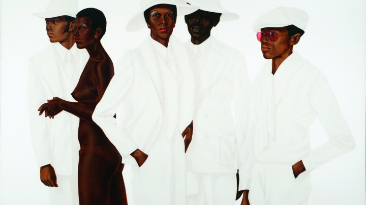
During our trip to New York I was also very affected by Barkley Hendricks’s painting “What’s Going On” painted in 1974. As we discussed in the gallery, the fact that the background is solid white, wipes out any kind of context or place and we are left with only the depiction of the figures. What I find so interesting with the stark contrast between the figures and the background, is the small exciting details and moments that are highlighted as a result, like the women’s intertwined hands with the red nail polish against the man’s jacket or the translucent lens of the man on the far right’s red sunglasses against the background. The figures are forced together in this strange compilation of bodies yet none of them interact. Each figure looks in a different direction and takes on a different action yet the space and distance between each figure is instantly erased because of the blending of their clothes into the background.

A Photo and A Portrait

When I was in Brazil, I came across this photo while visiting the MAR, Rio’s museum of art. It is titled “Rosa no arraial,” and it was taken by Luiz Braga. The woman has her back to the camera, her eyes gazing off into the distance and her body leaning in anticipation. Her facial expression communicates that she is fixated upon something. Her hair is in a small afro, accessorized with a patterned headband that matches her pale pink dress, and tiny earrings dangle from her lobes. In the background of the photo is an “arraial” or campground. The setting is blurred to fixate attention on the woman, but it seems like there is a carnival of some sort going on as there are bright colors and outlines of structures that seem like they could be rides.

This photo captivated my attention because of the way the woman pictured is being looked upon by whoever views this photo. While she is focused on something, we are focused on her, and she is what is attracting, luring, and drawing us into the work. The contrast of her skin tone with the dress and the brightness of the background work together, making her this enticing but mysterious figure because her gaze is positioned outside of the frame.

During our trip to New York, this portrait drew my attention because of its carefree nature. Henri Regnault painted Salomé first intending for her to be an African woman but changed the painting to a representation of a Biblical temptress, Salomé. The woman’s demeanor has an air of silliness. She sits upon a box that I assume to be filled with riches with her elbow poked out as if she were cocking her hip. Her other hand is wrapped around something in the tray on her lap. Her clothing is flowy and light, matching her energy. Her lips seem to be slightly smirking as if she is a few seconds away from breaking out in laughter, and her hair falls in loose, messy ringlets around her face. Another factor that drew me to this painting was the representation aspect of it. Because I read that this was originally supposed to be an Italian model depicted as an African woman, I was a bit upset. There is an overall lack of representation of black people within artwork, and because this painting was created in the 1800s, I’m not surprised at the original intent of the artist, but it shows the way in which black people were strategically excluded from this world.

Portraits that stop me in my tracks

On Sunday I was super excited to see Soul of A Nation because I meant to see it over October break but couldn’t find the time. I became even more excited when I saw Elizabeth Catlett’s “Black Unity” sculpture. In my house, we have a coffee table book about Elizabeth Catlett in which this piece has a double page spread. I have always been drawn to this particular piece mostly because I just found it to be really, really cool. On one side there are two faces (the portrait). For some reason these faces have always seemed like women to me and if I am correct, I think its an important decision to relate the unity of black women with the symbol of black power which can be found on the other side. These faces clearly draw inspiration from traditional African masks and I like how she consciously connected the struggle of all black power/liberation movements around the world together in one piece. More generally, I find the color and smoothness of the piece to be really beautiful and I didn’t get full sense of this beauty until I saw it in person.

Also in this exhibit, I saw “Harlem” by Herb Randall. I had never heard of nor saw any works by Herb Randall before this Sunday. I found this photograph to be really beautiful and was drawn by the boy’s big smile. However, upon closer inspection this picture became slightly unsettling. In the background, slightly out of focus, there is a girl with a look of either terror or curiousness or possibly both. Her expression is most likely due to the hand squeezing her friend’s face. From the angle of the hand it appears as if the hand belongs to the photographer. This raises some interesting questions. Did Randall just squeeze a random kid’s face in order to get this photo? Did Randall know this child? Was he already squeezing his face and then decided this would be a good photo?


(catlett) (Randall)

Powerful Portraits

When visiting the Brooklyn Museum on Sunday, I was very excited to get a chance to see the Soul of a Nation show.  I had read through the catalog, but I had yet to see most of the works in person.  Walking through the exhibition, I was totally enraptured by the works I saw hanging on the walls.  From images of people to works of abstraction, I was finding something different I liked around each corner.

In terms of portraiture, I found Wadsworth Jarrell’s paintings to be particularly compelling.  I was fixated on his painting Revolutionary (Angela Davis) from 1971.  Her mouth is frozen in speech, and words spiral out from her mouth forming her face, body, clothes, and the background.  She is the embodiment of her words, her voice and her passion.  The psychedelic colors push the image even further.  She seems otherworldly, and the image almost seems devotional.

As I look back on other portraits that have stopped me in my tracks, the Gerhard Richter portrait in the YUAG immediately comes to mind.  Though a very simple image, it is striking due to the fuzzy realism Richter portrays.  The portrait looks like a blurry photo, a clear likeness of an actual human.  He isn’t posed for the camera like a traditional portrait, he is caught at an awkward angle in a strange moment in a car.  Taken at the angle of a selfie, this portrait is incredibly intimate while depicted on a very large scale canvas. The man’s face pushes against the canvas, trying to breakthrough the fuzzy perspective.  He is instead, trapped in his car, and frozen in the moment.

Stopped In Your Tracks: Philip Lorca diCorcia and Barkley Hendricks

I have always enjoyed Philip Lorca diCorcia’s photographs. Although many of his portraits have stuck in my head, his portrait of Erno Nussenzweig is burned into my memory. Part of his series, Heads, the portrait of Nussenzweig’s title is actually Head 13 (2000). The anonymous and random individuals from the series, which were taken over the span of two years, were photographed from a hidden camera in a Times Square subway station. The only reason that Nussenzweig’s name was ever released was due to his lawsuit against diCorcia that turned into a public scandal. Regardless of the various issues underlying the ethics of the portrait, the image itself has always intrigued me due to its combination of documentary street-style photography and elaborate staging. The result is an enigmatic image that almost seems like it is a still from a film. The portrait, though elaborately staged, is from real life and his work, effectively, reinvented the genre of street photography for me.

After today’s trip, Barkley Hendrick’s portrait, What’s Going On (1974), keeps reappearing in my memory. Although Barkley’s portrait is an oil painting, there is a photographic quality to his work that reminds me of DiCorcia’s staged portriats. This portrait, set against a plain white background, is highly stylized in a similar manner to DiCorcia’s Head series.

Philip Lorca diCorcia, Head #13 (2000)

Barkley L. Hendricks, What’s Going On (1974)

Calhouns’s Master Should Stay

People in portraits know they’re being observed and present themselves to the artist as they would like to be portrayed. While the artist’s decision to actually paint them as they would like stands apart from the establishment of the work as a portrait, artists with artistic merit tend to provide their own interpretations of their subjects. However, the artists who created many of the Yale Dining Hall portraits painted their subjects exactly how they wanted to look and that’s exactly what makes the works so tasteless. The artists painted like boring photographers yet did so with deliberately old-fashioned, pretentious verve.

Take the oil on canvas portrait of Calhoun College’s founding father, Master Arnold Whitridge. His fingers hold his place inside a book as if he couldn’t bear to set it down for the portrait. His gentle eyes and slightly raised brows beg the question, “Do you have something insightful to add?” His perfectly-trimmed half-oval, snooty mustache looks more like a thin piece of greyish paper stuck to his upper lip with double-sided adhesive tape than a realistic stache.

Dressed in a suit, tie, and royal-blue cape, the man evokes the peak of the elitism he sought to represent. Cramming as many generic symbols of intellectual and economic power into the work as possible appears to be the artist’s goal. While he does so flawlessly, the work remains devoid of sensibility and artistic taste.

Despite lacking artistic quality, the work should not be removed from the Hopper Dining Hall. Moving it to some distant corner instead of its current prime position at the entrance wouldn’t be the worst decision, but forgetting that the work represents a part of our university that still influences administrative decisions today would be a mistake. We must remember our overwhelmingly white, bourgeois roots, so we don’t repeat past wrongs and constantly move towards a more inclusive campus culture.