David Hockney’s Idle Worlds


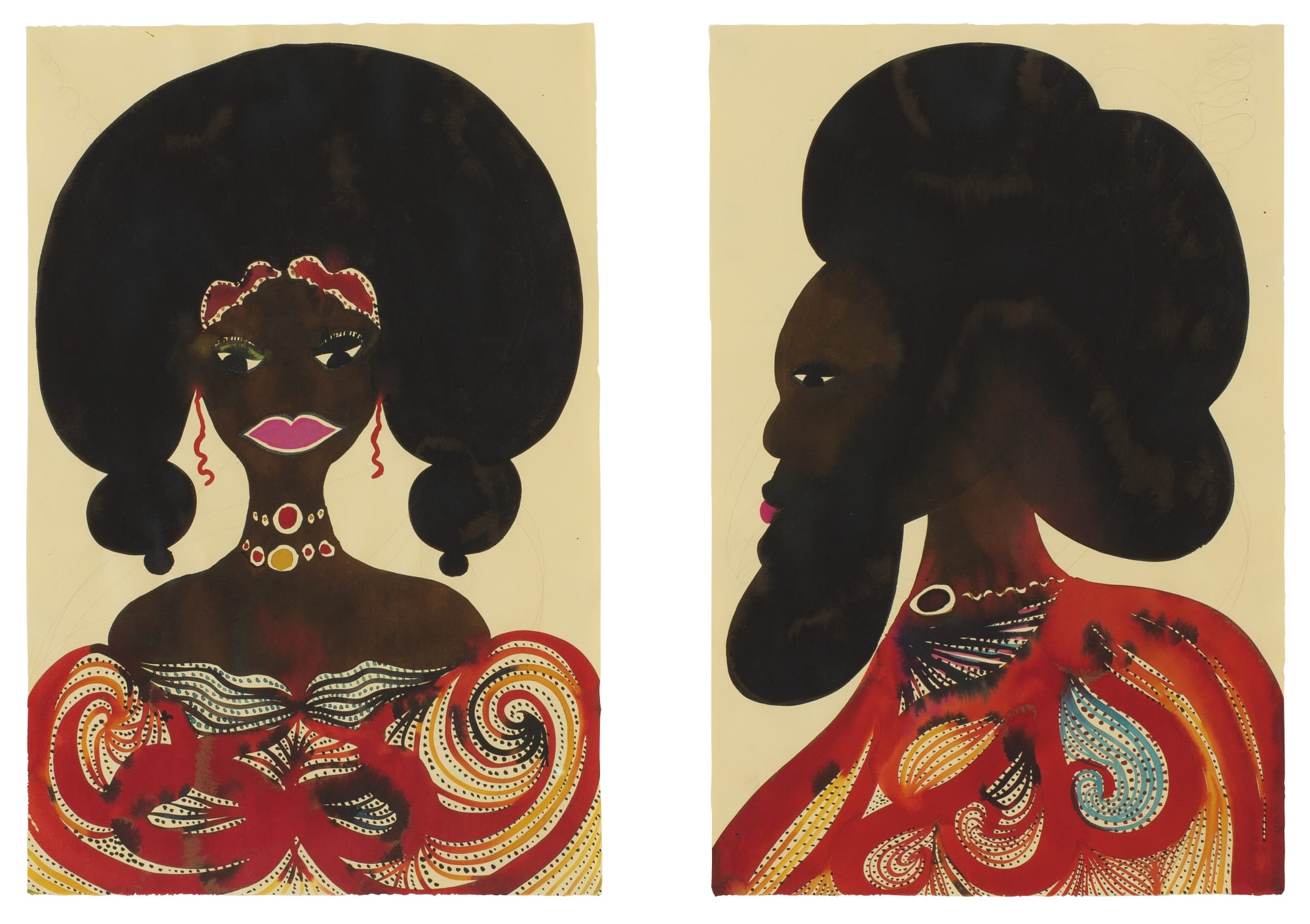
After reading several reviews of Hockney’s work, specifically his figurative art, people stated that through his paintings, such as “Sunbather” or “Peter Getting Out Of Nick’s Pool” he was able to represent the negative aspects of the 1960s through these serene scenes. I’m skeptical. I guess my question would be how did Hockney include the bigger picture of this time period and the setting of Los Angeles in all of its complexity through his subject matter and painting technique instead of just depicting idyllic scenes of wealthy, white people enjoying their homes? How was he able to go beyond observation and the love of his new home to capture the deeper issue of these scenes?

R.B. Kitaj Rejected as Usual

Emboldened by thick lines and bright flashes of blues and yellows, the man stares fearlessly ahead with his right hand cocked on his hip and his left reaching around his entire head, striking a pose. His struts his flexed yet fatty leg forward, daring us closer. His fleshy, almost-in-shape physique commands our attention towards his shocking sensuality. RB Kitaj’s “The Sensualist” evokes Kitaj’s signature expressionist blend of vibrancy and emotional depth. The Yale University Art Gallary, however, will not acquire this work at auction this year. The gallery currently holds none of Kitaj’s work because he never achieved the same critical acclaim as other white, late 20th-century male figurative painters like Chuck Close and Jack Levine. The museum cannot highlight an artist who was not even good enough to earn the acclaim of esteemed art critics. While the work seems compelling, the artist did not meet the threshold of fame required by our world-renowned institution.

Image result for rb kitaj the sensualist


Henry Moore’s Reclining Stringed Figure

Image result for henry moore reclining stringed figure

I was immediately attracted to Henry Moore’s Reclining Stringed Figure when I saw it while flipping through the acquisition catalogues at the YCBA. I found the interconnectedness of the brass “strings” intriguing and I loved the way the piece challenged my mind as I tried to see the shape as a figure. I thought the shiny bronze surface would catch the eyes of visitors to the gallery and pleasantly confuse them as it did me, and maybe convince them to step closer as they attempted to figure out what the piece was. The YCBA also doesn’t exhibit much free-standing sculpture, so I thought this would add a new visual experience to the space.

Sadly, one of the few sculptures in the YCBA’s contemporary gallery is a Henry Moore piece very similar to this one. Seeing how similar they were, I didn’t think having a second one would significantly change a viewer’s experience of the object already in the collection, even though this one up for auction I believe to be superior aesthetically and compositionally. In the end, a painting seemed to fit into the collection better than a sculpture and Travis and I ended up choosing a large-scale contemporary painting by Cecily Brown that I felt created an interesting narrative with another piece on display in the collection.

Adrian Ghenie’s Nickelodeon

nickelodeon painting에 대한 이미지 검색결과

Merritt and my first choice for the acquisition assignment was Adrian Ghenie’s Nickelodeon. When I first came across the painting in the Christie’s catalogue, I was immediately struck by the bold brushstrokes, the mutilated faces, and the painterly thickness permeating the painting that made it so … tangible. It was as if the figures in the painting were ready to walk out, and the  floor would feel like actual rough wood to the touch. Given the size of the work, I thought it would make a powerful impact to the visitors of YUAG if hung in the lobby of the gallery to greet the visitors.

However, in the end we decided that the painting’s visual virtuosities were its main, if not only, appeal. The YUAG’s mission statement makes it clear that the gallery has social and communal mandates that go beyond visual virtuosity. Ghenie would be another European, white male addition to the many already occupying the gallery’s space.

In this sense, Mutu’s Try Dismantling the Little Empire Inside You came across as a much more holistic acquisition for the YUAG. In addition to its visual appeal, the piece was by an African female artist. Furthermore, the personal and expressive content of the painting would challenge the stereotypical association, which the YUAG could to more to combat, of African Art with antiquity and the tribalism there in. Finally Mutu is an Yale alumna. The decision was not difficult to make.

The Fish I Threw Back

Image result for daytime astronomy peter doig
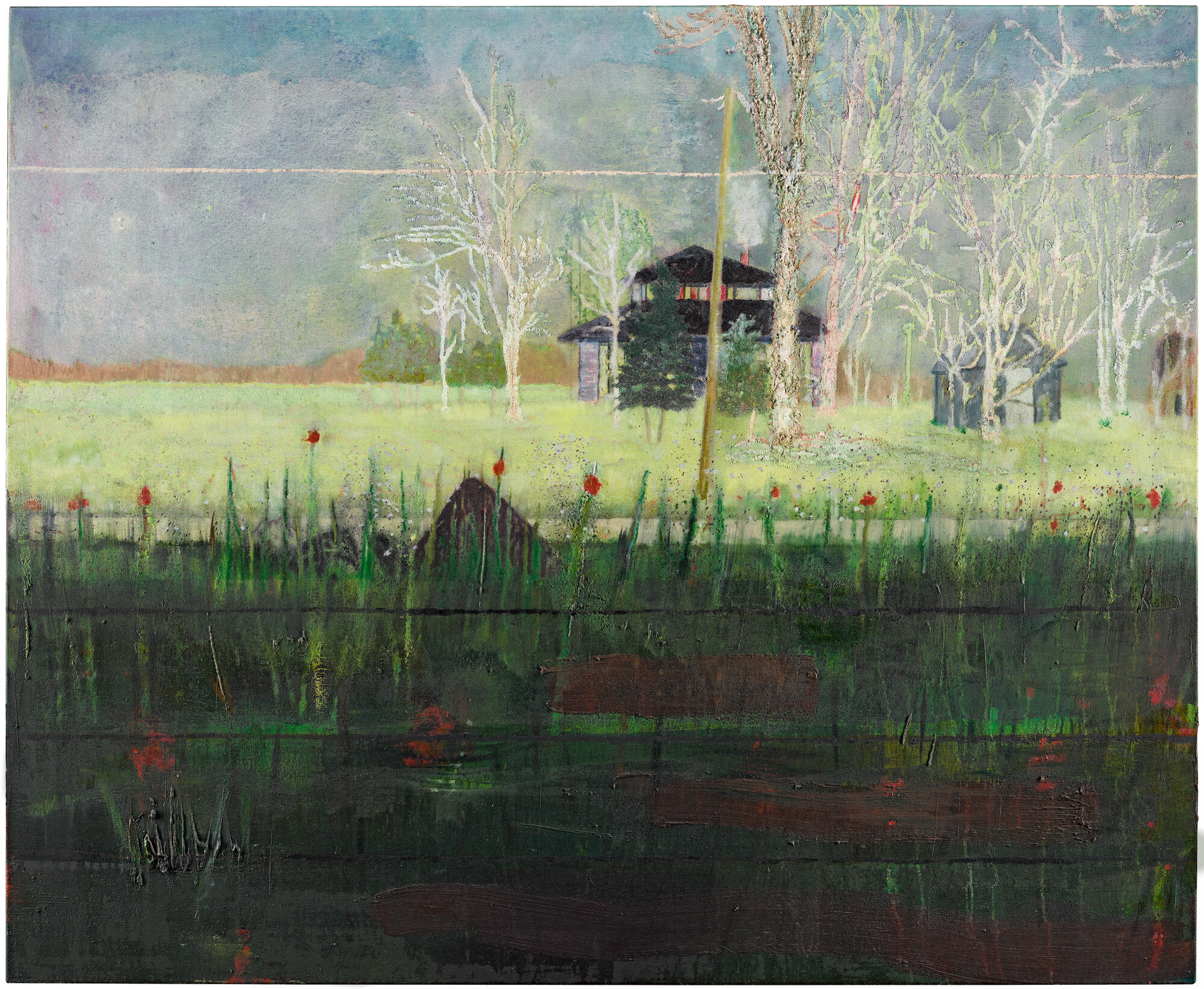
Peter Doig’s “Daytime Astronomy (Grasshopper)”

This painting’s magical quality drew me to it. The dark-roofed house sits in a wonderland of wispy, bone-white trees. Doig, through the two tones of the grass, provides a depth to the piece, as his layered brushstrokes give the ground such a creamy, flowing texture that it looks like two rivers. Those impasto-esque touches in the dark section also create a three-dimensionality; the blades of green literally jut off the canvas, making the house and the work being done inside feel ever more remote. How Doig leads your eye both towards and into the center is evidence of his piece’s immersive character. The landscape also looks to exist out of time, with the bare trees signaling winter but the grass almost bursting with the richness of spring. I ultimately cast it aside because I was looking for a piece that would fill a need in the gallery better, whether in terms of demographic representation, compositional strategy, and subject matter depiction. The Cecily Brown piece Amy and I selected adds more value to the collection from that standpoint. But I’d still love to see that Doig on a wall.Image result for cecily brown where they are now

Cecily Brown’s “Where They Are Now”


Next time…

When exploring the Sotheby’s catalog, I was immediately drawn to a work by Tom Wesselmann.  I have always been interested in his work, and so I was excited to see that some great works by him were coming up at auction.  He was a very prolific pop artist, and I was surprised to see that YUAG has limited examples of his work: two paintings, one drawing, and one print.

Though I think it is a great example of Wesselmann’s oeuvre, showcasing his interest in the female nude, bright colors, and a style of pop-art that resembles collage, it seemed to me that it was more urgent to consider the artist minorities that the YUAG collection is tragically lacking.  Additionally, this piece, due to his status as a blue-chip artist, is priced at an estimate of $1,000,000 to $1,500,000 and seems to be much more difficult to justify in terms of pure economics.

Rebecca and I then came upon the Elizabeth Peyton portrait of Georgria O’Keeffe.  With this work, we were able to forge both an intimate connection between Yale’s collection and the subject, and make a case for a female contemporary artist.  If this Peyton painting were purchased, the gallery’s representation of female artists will be more robust.

Cecily Brown

Before Marianne and I settled on a final acquisition for the YCBA, I entertained the possibility of choosing this work by Cecily Brown entitled Girl Trouble. It is visually striking, fiery flesh tones forming abstract figures. It appears that a woman on all fours stares into a mirror while a figure stands over her; however, the scene is ambiguous. There is a violence dormant in the slashes of paint, an undercurrent of chaos. The work is absorbing, provocative, and erotic. It makes an impassioned statement of femininity and raw power. However, we eventually settled on Njideka Akunyili Crosby’s portrait, Mimetic Gestures. 

Our choice was not based on some deficiency in Brown’s work, but rather, on Crosby’s immense relevance to the YCBA. Crosby is from Nigeria, which used to be a colony of Britain. Through her work, she explores the interaction of British influence with Nigerian culture. Her art’s presence in the YCBA would add an invaluable counter-narrative to the British imperialist narrative that pervades the museum. Furthermore, the fact that the work is a large, bold portrait of a Black woman, refusing to hide behind abstraction, gives it a blatant political immediacy that Cecily Brown’s work fails to match. This is not to say that Brown’s work is less moving or interesting—however, the YCBA has some major political restructuring to do, and a work like Crosby’s would accomplish this much more effectively than Brown’s.

Chris Ofili, Untitled

Last week, while flipping through auction catalogues at the YCBA, I was instantly drawn to a thumbnail image of this painting by Chris Ofili. The vibrant red and deep brown hues of clothing and skin, pigment seeping into each other at these figure’s collars, feel elegant and natural as well as bold. It is a painting full of contradictions.  My eye is drawn to the crisp boundary between the woman’s pink lips that somehow manage not to clash with the rush of red seeping into her sternum. Ofili’s work is both regal and warm, rich and clean. It was one of two final picks that my team analyzed for this project, and though in the end there was a work we ended up loving more, this painting remains one of my favorites.

“Nickelodeon” by Adrian Ghenie

One painting that I was extremely drawn to but didn’t ultimately select was Adrian Ghenie’s “Nickelodeon”. I found the paint quality to be the most intriguing element in the piece. Some parts of the composition are left undeveloped and empty while the faces of the figures are immensely layered with paint, allowing the artist to be able to smear, wipe, and scrape the surface. The way Ghenie paints somehow combines extreme realism with a very destructive kind of abstraction. There are two figures on the left of the canvas where the paint is wiped and brushed away, creating the feeling of time passing or that the figures are about to vaporize. The man in the foreground’s face is a ghastly red and his face appears to be literally melting and dripping to the floor.

This painting is a feast of texture. Overlaid on top of the figures are streaks of color either blurred or harshly applied. The wood paneling creates a very deceptive space that confuses foreground and background that seems to be crumbling on the edges.

There is something extremely ominous and terrifying about this piece. The way the wooden slats of the floor lead back into the mass of people all standing in confusion and despair. The way the figures stand reminds me of Rodin’s “The Burghers of Calais”, especially the man on the far right, where the figures all await their executions and we enter into each person’s personal drama and mindset. Each individual seems to be going through a psychological transformation or metamorphosis where their inner feelings are overtaking them in a physical way. Everything, including the floors and walls seem to be deconstructing and falling apart. As viewers, we hold on to the recognizable and human aspects while the rest seems to break down and decompose into literal paint.

We decided not to choose this painting because we didn’t think it would bring anything new to the gallery’s collection. Ghenie’s main reference points were Bacon and Rothko and as visually compelling as this painting is, we thought it was more important to find a voice that is not already represented in the gallery’s collection, rather than continue a story that we all know very well.

A Fish I Threw Back

For the Acquisition Board meeting, Lucy and I selected Elizabeth Peyton’s oil painting, Georgia O’Keeffe (After Stieglitz 1918), from 2006. As soon as I saw the work, I was instantly intrigued by its power. Peyton, depicting O’Keeffe with her chin held high and shoulders drawn back. makes O’Keeffe seem incredibly confident. The harsh and sharp black lines and contrasting colors that Peyton employs, moreover, adds to the angularity of O’Keeffe’s facial structure, adds a sense of decisive strength to the work. For this work, Peyton used Alfred Stieglitz’s photograph of O’Keeffe from 1918 as the source image. The work, therefore, seems very relevant to the YUAG as its collection includes work by both Stieglitz and O’Keeffe.

Originally, I was very interested in a work by Jean Dubuffet. However, as I considered the YUAG’s current collection, I felt that one of the areas in which the gallery could improve is in their inclusion of women. Last year, I was greatly impressed by the Annie Albers show and would like to see the legacy of that show continue. By selecting Peyton’s work, rather than Dubuffet’s, the YUAG could highlight the power of female artists, placing Peyton’s work next to that of O’Keeffe.

Elizabeth Peyton, Georgia O’Keeffe (After Stieglitz 1918), 2006 signed, titled, and dated 2006 on the overlap oil on canvas, 30 1/4 by 23 1/4 in.